How to Use Tonal Contrast in Snapseed? – Beginners Tutorial
Enhance your photos like a pro with Snapseed’s Tonal Contrast tool! In this beginner-friendly tutorial, I’ll show you how to use this powerful feature to add depth and bring out hidden details in your images. Whether you’re working on landscapes, portraits, or any type of photo, Tonal Contrast can make your edits pop. Perfect for anyone new to Snapseed, this step-by-step guide will help you achieve stunning results with ease. Let’s get started!
This video is from our Snapseed Photo Editing Course.
Video Summary
In this tutorial, the instructor explains the Tonal Contrast tool in Snapseed. He describes it as a more sophisticated and realistic alternative to the “HDR Scape” tool. While standard contrast adjustments affect the whole image, Tonal Contrast allows for localized contrast editing, segregating the image into high, medium, and low tones. This enables you to add depth and drama to specific areas (like the sky or foreground) without creating the “halos” or artifacts often seen in heavy HDR filters.
Key Concepts & Controls
- Localized Contrast: Unlike the “Tune Image” panel which focuses on exposure, this tool focuses strictly on the contrast (the difference between light and dark) within specific tonal ranges.
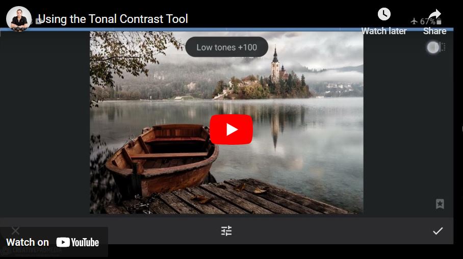
- The Tonal Ranges:
- High Tones: Brighter areas like the sky or white clouds. Cranking this up adds dramatic texture to the atmosphere.
- Medium Tones: The “neutral gray” areas that often dominate the image. Increasing this typically has the biggest overall impact on the shot’s “pop.”
- Low Tones: The darker areas, such as shadows in a boat or a wooden deck. This adds grit and detail to the darker parts of the composition.
Time Stamps
- 0:00 – Introduction to the Tonal Contrast tool.
- 0:25 – Comparison to previous tools: Focus on contrast segregation vs. exposure segregation.
- 1:13 – High Tones: Adding drama specifically to the sky and bright reflections.
- 1:59 – Explaining Contrast: How it “dodges and burns” the image simultaneously.
- 2:41 – Medium Tones: impacting the waterfront and average tones for a “3D” look.
- 3:54 – Low Tones: Enhancing detail in the foreground and dark structures.
- 4:30 – Tonal Contrast vs. HDR Scape: Why this tool is “cleaner” and looks more realistic.
- 5:04 – Protect Shadows & Protect Highlights: Examining these settings and their limitations.
- 6:12 – Discussion on the tool’s quirks: Why “Protect Highlights” might unexpectedly increase brightness.
- 7:44 – Final recommendation: Using the tool to add professional drama.